


In part two of this two-part editing series of Oh Shoot Podcast!, Cassidy Lynne (@cassidylynne) dives deep into all things editing. This episode covers tone curves, HSL, color grading, Lightroom shortcuts, and more!
Listen to the full podcast on Spotify!
If you haven’t listened to Part-One of the Editing Series, listen to the editing 101 podcast on Spotify, watch it on Youtube, or catch up on the blog!
Timeless Presets for Photographers
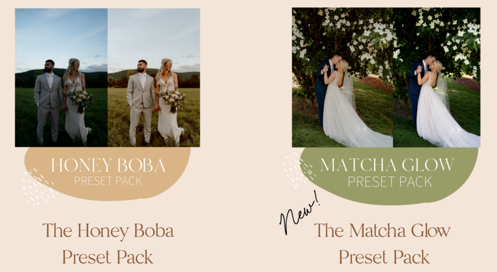
If you’re in need of new Lightroom presets then my Honey Boba and Matcha Glow preset packs might be a fit! The Honey Boba pack is the Lightroom preset for golden photos with creamy textures! My Matcha Glow pack is for the photographer looking for timeless presets that are true to color! Check out my presets on my shop page here!
Editing in Lightroom Classic
Back to editing! Editing takes place in the Develop tab in Lightroom. I edit using Lightroom Classic and it’s available only for desktop and has more capabilities than Lightroom CC. The main sections I focus on are:
Basic Exposure Settings
Exposure, contrast, whites, blacks, shadows, and highlights.
This is the area I hang out most. It’s where I’m making the every day tweaks to all my photos. I mainly fix exposure, temperature, and tint, and keep going on. Sometimes I sync my settings to photos and then go through each photo and tweak these basic exposure settings.
HSL & Color
This section of Lightroom is where I’m making color tweaks on each image. For example, if I look at a photo and the skin tone is too orange, I’m going to the HSL color section to fix that.
HSL mainly impacts skin tones, greens, jeans, and water.
Skin tone is primarily in the reds and oranges in HSL.
Yellow and green colors impact mostly grass and trees.
Jeans and water is impacted by blue, aqua, and a little bit of purple/magenta.
Color Grading
Color grading is underneath HSL. I use it less than HSL and exposure, but more frequently than the tone curves. Color grading is helpful in some scenarios as an alternative to temperature and tint.
Calibration
Below color grading is calibration. Calibration is changing the red, green, and blue pixels of the image, not necessarily just the red, green, and blue visuals. When you are using calibration and you look at a photo and look at the color orange, within orange there is a percentage of RGB pixels that make up the color orange. The calibration section is changing the actual pixels of the RGB colors and you’re able to get a very unique look with your photos.
For example, photos with an orange and teal look used to be very popular and you get that in calibration. You pull the red hue slider all the way to orange. And you take the blue hue slider and slide it all the way to blue, so any blue color is more teal.
Calibration is a fun way to add a unique style to your colors and this is where I find a lot of presets vary in calibration.
5 Things I Adjust With Every Preset
#1 Tone Curves
#2 Basic Exposure
#3 Calibration
#4 HSL
#5 Color Grading
Those are the 5 areas I adjust to make a preset. Then I click the plus button on the lefthand side of the screen on the preset tab and create a preset with those settings. Make sure with presets, you are not changing temperature and tint! Your photo will load into Lightroom with the white balance you shot it at, so you can change the white balance with the preset you edit with and make it perfect for that photo. It’s important to leave everything as shot for temperature and tint because it varies from photo to photo depending on your setting.
Deep Dive into Tone Curves, Color Grading, & Calibration
For a deep dive into what I adjust in the tone curves, color grading, and calibration tabs I highly recommend listening to the podcast and opening up Lightroom to play along with the settings. At 24:55 I start diving into tone curves! Here’s a link to the episode!
What to Look For When Editing Photos
When you’re editing on a day-to-day basis here’s what you should be looking at.
#1 Skin Tones
The first thing I look for is skin tone. Ask yourself the following questions:
- Does this skin tone match the rest of the photos I’ve edited for this session?
- Does this skin tone match all of the other photos I’ve delivered overall? Does this match my previous work?
Skin tone can be a deal breaker when it comes to edits. Their faces and skin tone is the first thing your client looks at in photos. Getting that skin tone consistent is so important because it’s something everyone pays attention to.
Memorize the skin tone you like and memorize the hues of it. How much red is in it? How much orange is in it? Memorize it for multiple shades and for all races. You want to be able to look at a skin tone and know how to tweak it. All skin tones are different. The thing with that is you have to memorize the orange of the hue that you like and be able to detect based on the skin tone in your image where the orange needs to be.
The first thing I do when I click on a photo is adjust the temperature and tint only looking at skin tones. I can tell if something is too pink, too cool, too orange, etc.
#2 Neutrals
The next thing I look for when editing is neutrals. I like my neutrals to be a true neutral! Basically true to color when it comes to neutrals in an image.
Look at neutral colors and ask:
- Are the whites actually white?
- Is the black actually black?
- Is this what the color actually looks like?
I’m looking at my neutrals and if they’re not a true neutral, I’ll go into my temp and tint and mess around with it until I get a true neutral. If I can’t get them to a true neutral by just temperature and tint and then I’ll go into color grading.
#3 Exposure
The other thing I look for is exposure and use my exposure slider to fix things. Right away based on your gut instinct ask:
- Is it too bright?
- Is it too dark?
- Do any of the colors stand out or look inconsistent with the rest of my work?
Use your exposure slider to fix it and look at the colors in the photo.
Lightroom Tips & Tricks to Streamline Your Editing
Use the comparison tool
On the bottom lefthand side of the screen is the R/A button. It allows you to compare the photo you are currently working on with a previous edit from your session. I like to use this when the lighting changes or when the photos are in a different location. When something changes in my images I like to compare two photos just to see if the skin tones and exposure are the same.
Grid View in Library Tab
When you switch to the library tab in Lightroom Classic you can switch to a grid view. It’s an option at the bottom left of the screen. I like to look at all of the photos as a whole and I bring up my thumbnail size so I can see more detail in the photos. Maybe 12 photos on the screen at a time. I’m looking for consistency. Does anything stand out color-wise or seem out of place? Do I have two photos that are super similar? That’s what I’m looking for and it helps overall for doing a final review.
Keyboard Shortcuts to Streamline Editing
- R for crop instantly pulls up cropping view.
- In crop view, use X to change the orientation of the photo.
- Backslash button \ for before & afters.
- Command + Z for undo.
- Sync Settings Button: Select your first edited photo and select up to the photo you want to be synced and hit the sync setting button on the right-hand side beneath the develop tab. It’ll sync all those photos to the edit that you want.
- Copy & paste: Command+V and Command + C to copy and paste edits to photos.
Recommended Presets for Photographers
Having a good base preset is key for consistency. These are Lightroom presets I recommend for photographers.
Matcha Glow & Honey Boba Presets
These are the presets I actually edit with and have been for years!
Tons of people use them and they look great!
Dawn is a queen and all of her presets are incredible!
She was a guest on this podcast and has some awesome presets as well.
That wraps up part two of editing 101!
Show Notes
Get Picsello 3 Months Free: https://www.picsello.com/friends-of-picsello/cassidy-lynne
$20 off your first month of Nuuly using OHSHOOT20: https://bit.ly/3s36kdr
NEW EMAIL TEMPLATES FOR PHOTOGRAPHERS
Get 50% off Honeybook here: http://share.honeybook.com/cassidylynne
Want more free education? Check out my website for photography freebies, presets, & courses!
Are you a part of our photography Facebook community group? Go to http://facebook.com/groups/cassidylynne/ and join the discussions of thousands of other photographers.
Follow Cassidy!
Instagram: @cassidylynne
